The KashFlow has been completely re-engineered and contains lots of improvements and new functionality throughout, all whilst trying to keep the experience as familiar as possible to the classic KashFlow and retaining the magic that made the classic application an intuitive, simple and easy to use system.
Key Changes
Layout Changes
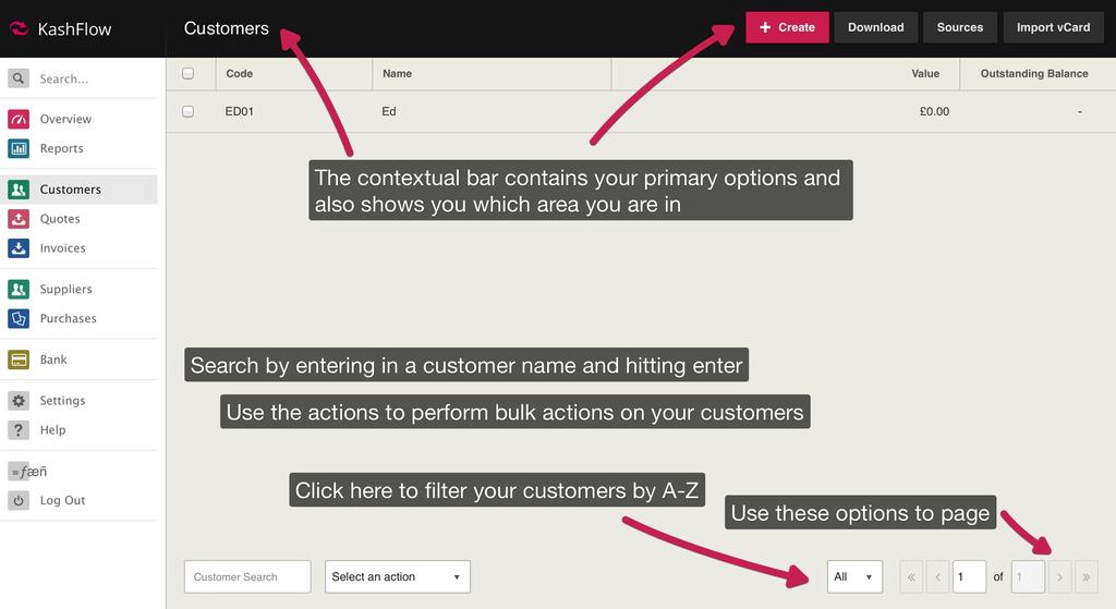
When you first log in, to the new KashFlow, you’ll see that the menu bar is now down the left hand side, and a new black contextual bar is along the top. The contextual bar tells you what area you’re in, and gives you relevant buttons in the top right.
The global search option is now located at the top of the menu on the left. Simply type your search term in the box and hit enter.
Language Changes
- Types are now Codes – Previously you had Sales Types, Outgoing Types and Transaction Types. To simplify things we’ve renamed these to Sales Codes, Purchases Codes and Transaction Codes respectively.
- Repeating Items – Previously we had repeat billing, repeat purchases, and repeat transactions with the words recurring and repeated interchanged. We’ve unified these and will refer to these as repeat invoices, repeat purchases and repeat transactions throughout the app consistently.
- Bulk Payments have been renamed Batch Payments in order to simplify language from users both unfamiliar with any accountancy applications and those who have some experience.
List Pages
We’ve spent time making the customers and suppliers list pages quicker and easier to filter, sort, and navigate. The list below details the changes to these pages;
- Contextual Bar – The contextual bar now contains the buttons for creating a new customer, downloading your customers, accessing customer sources and importing a customer via a vCard. On the supplier’s page, only the Create Supplier button will be shown.
- Search – This is now located at the bottom, simply type in a customer/supplier name or code and hit the enter button to search.
- Actions (Customers only) – You can use the tick boxes on the left of the customers list to select customers, and then use the ‘Select an Action’ dropdown to email these customers statements, print statements, archive them, or delete them.
- A-Z Customer Filter – The alphabar has been changed into an alpha-dropdown. To filter customers/supplier, simply click the box on the bottom right that has ‘All’ selected by default and choose a letter/number to filter by.
- Paging Options – Paging is now on the bottom right and you can jump to the first/last previous/next page by clicking the appropriate button. You can also now specify a page to jump to by typing a page number in the box and hitting enter.
Quotes & Invoices
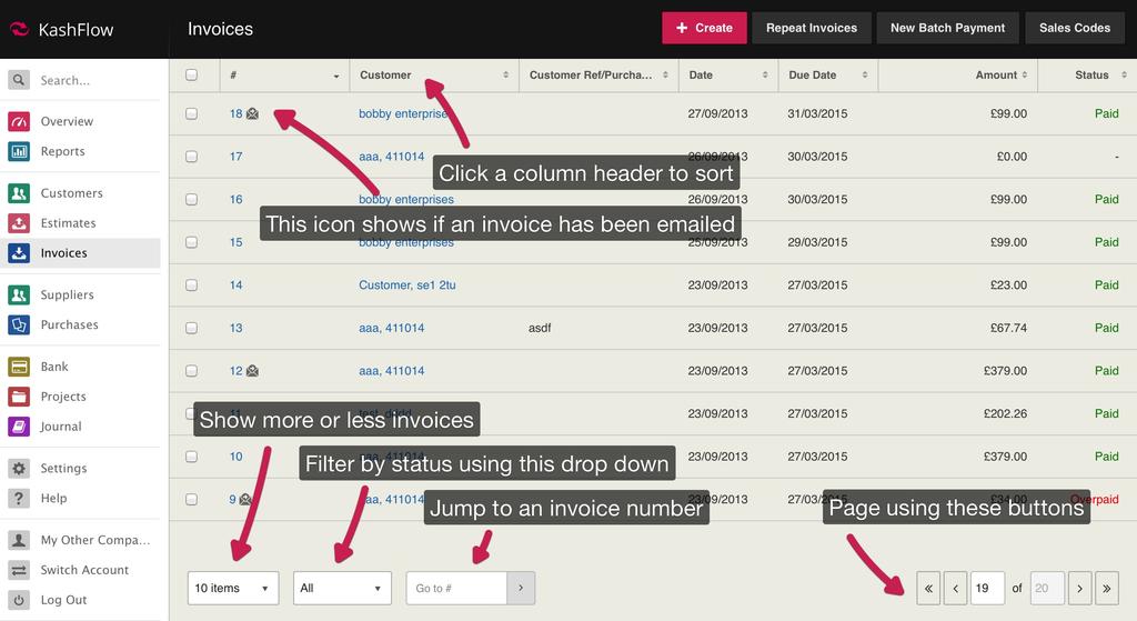
Most of our changes are focused here. We’ve spent time completely overhauling these pages to make raising a quote an invoice a much quicker and easier process. When clicking Invoices from the menu, you’ll see;
- Bulk Payments have been renamed Batch Payments
- Searching, filtering and navigation options are fixed to the bottom meaning you won’t have to scroll.
- You can sort by any column by clicking on the header.
If you click on an existing invoice you’ll notice that the invoice now looks much more like it will when it’s printed or emailed, we call this the view mode. All the relevant information pertaining to invoice is displayed on screen including addresses, paid status, invoices dates and line items. Payments, notes and files are located at the bottom and show the number of items associated to this invoice.
At the top you’ll see all the actions available for this invoice. All these work just as before, most will look a lot more user friendly and be much quicker than in the classic application. Some changes to note are that anything you print will open the document in a new tab.
If you click the edit button, you’ll be presented with the edit mode for the invoice. This is how an invoice looks when you first create it. From here, you can enter in all the relevant information for the invoice. Some changes to highlight is the ability to search for a customer directly on the invoice and quickly add a new one by pressing the plus button, and the ability to quickly add line items or a comment by clicking the links.
Line items and comments can also be easily rearranged by simply dragging and dropping by clicking and holding the icon on the left. You can easily tab between fields and enter as you go, you can also delete any line items by clicking the little x on the right. You might also notice that sales types are now referred to as sales codes. This has also changed for outgoing types, now referred to as purchase codes, and for bank transaction types, now referred to as bank codes.
When you’re done, just click save. You’ll be brought back to the view mode of the invoice.
To add any payments, just click the Add Payment button at the bottom. Like in classic KashFlow, the full payment will be the default amount. To apply just click Save.
Additional Users
You can create and manage additional users by going to Settings > Additional Users. Additional users you can create will have full access to invoices, quotes and purchases. We’ll be rolling out additional user options to further areas shortly along with fully customisable permission options.


