Are You a Business Card Purist?
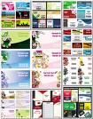
 Business cards seem to be getting flashier and flashier. I’m seeing more and more cards that are covered in marketing messages, calls to action and sales pitches.
Your business card is NOT a sales brochure so don’t treat it like one.
Your business card should have your logo, web address and contact details – it doesn’t need much more than that.
It doesn’t need to fold out into an origami duck, it doesn’t need to be inserted into a CD drive, it doesn’t need to tell us about your 10% discount to new customers, it doesn’t need to play the national anthem whenever it’s picked up and it doesn’t need to taste of strawberries when you lick it.
Putting anything on the back of your card is a big no-no too.
At networking events and so on where I might meet a lot of people, I tend to make a note on the back of the card to remind me who it is and why I took their card, ie: “bald bloke from Manchester with the funny nose, interested in integrating their software with KashFlow”. I know I’m not alone in this.
I’ve lost track of the number of times I’ve struggled to find a space to write anything on a card.
So please, keep your business cards simple. Don’t end up like this man:
