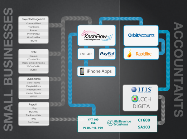
A Visual Representation of the KashFlow Ecosystem
Our eco-system is getting pretty big now with 50 integrated products or services as well as a number of our own products.
As the company grows we found it was useful to have a visual representation that illustrates to new staff how it all hangs together.
We wanted to show what products we have ourselves, how that fits in with other products, who uses them and how data flows between them.
So below is a the flow chart we use to demonstrate this (click for a larger version).

You have our Add-Ons (just some, there are too many to fit on the page!) on the left, along with our own apps and the API for the SME market and how that integrates with HMRC.
The on the right you have our own products for accountants – Orbit and RapidFire – as well as products from third-parties like Iris, CCH and Digita and again how that sends data to HRMC.
It’s not perfect – there’s much more that could and should be added. But it’s a starting point.
