Introducing the New & Improved Customer and Supplier Areas
After reviewing the most popular posts over on KashFlow Canvass, we’ve opened up our toolkit and made a few changes to the Customer and Supplier areas in KashFlow!
In this blog, we’ll give you a quick overview of which processes we’ve simplified, how your work day will be speeded up and what else has changed for the better.
What’s new?
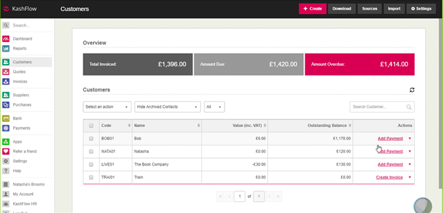
First up, we’ve introduced a fresh new dashboard that shows all your key information at a glance. You can sort the customer tables alphabetically, by value, by code or by outstanding balance with a click, so it’s easy for you to get everything you need to see on screen.
Just getting set up? We’ve added a new import button to the top of the dashboard so you can get all of your facts and figures into KashFlow without having to navigate through the app. It’s an intuitive addition that should get you going in less time than ever.
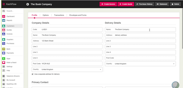
Within the Customer and Supplier areas themselves, we’ve refined the layout so that the information you need is more clearly displayed and easier to edit.
You can also now add a delivery address by default, just by ticking the relevant box.
The Customer and Supplier areas also now have a number of tabs for easier navigation, including “Options”, “Transactions” and “Envelopes and Forms”. You can learn about each of these by logging in and playing around with the software.
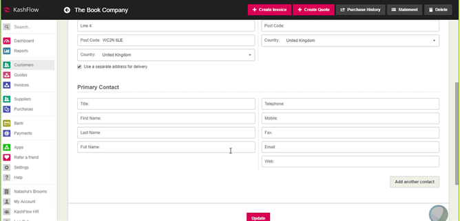
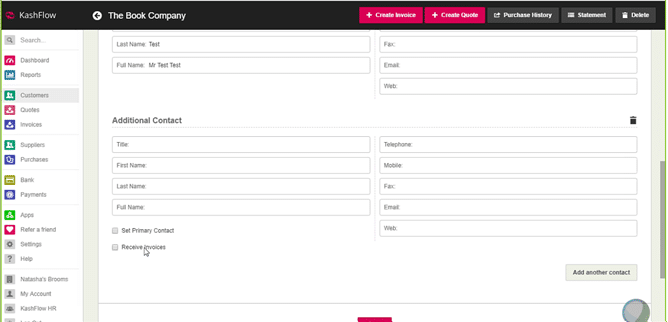
The next feature is one you’ve been waiting for, and we’re very excited to deliver. You can now add multiple contacts to your customer or supplier record, and allow them to receive invoices.
With 450 votes in KashFlow Canvass, this is an update we’re proud to deliver to our customers and one that will make your day-to-day use of KashFlow more than before.
For each customer or supplier, we’ve also redesigned how transactions are displayed so that they’re now all in one table. Again, you can choose how to filter and sort your data so you’re getting to see what you need to.
At a glance, you’ll be able to see your key figures across the dashboard – including “Total Invoiced”, “Amount Due” and “Amount Overdue”. From here, you can scroll down and sort through the data to find what you’re looking for in a matter of seconds – with a clear sign as to what’s overdue, paid and part-paid.
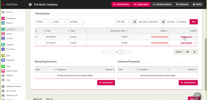
When you need to, you can also email CSVs directly from this page – again cutting down your navigation through the app and streamlining the most common jobs.
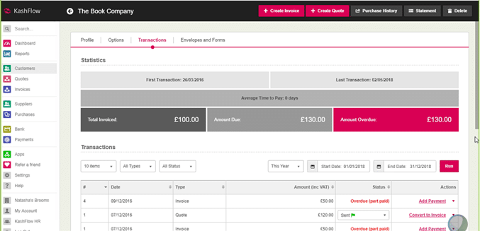
One final feature we want to draw attention to is the new action menu on the customer and supplier dashboard, as well as on the customer’s transaction tab. The action menu helps you carry out your most frequent tasks in just one click.
What’s next?
After testing these changes with our customers, we were pleased to find that 89% of BETA testers said these refinements will improve the way they currently use KashFlow. These new updates will be available from 10th May 2018, and we’re keen to hear what you think once you’ve had chance to explore them for yourself – let us know in the comments below!
Are there new features you want to see in KashFlow? Head over to KashFlow Canvass to let us know what you want to see.
